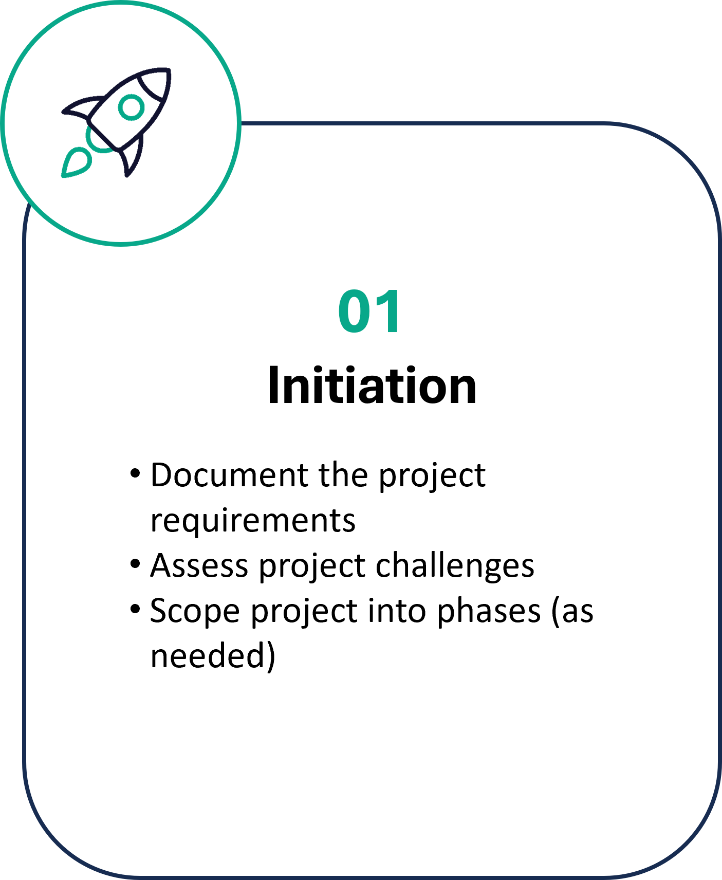
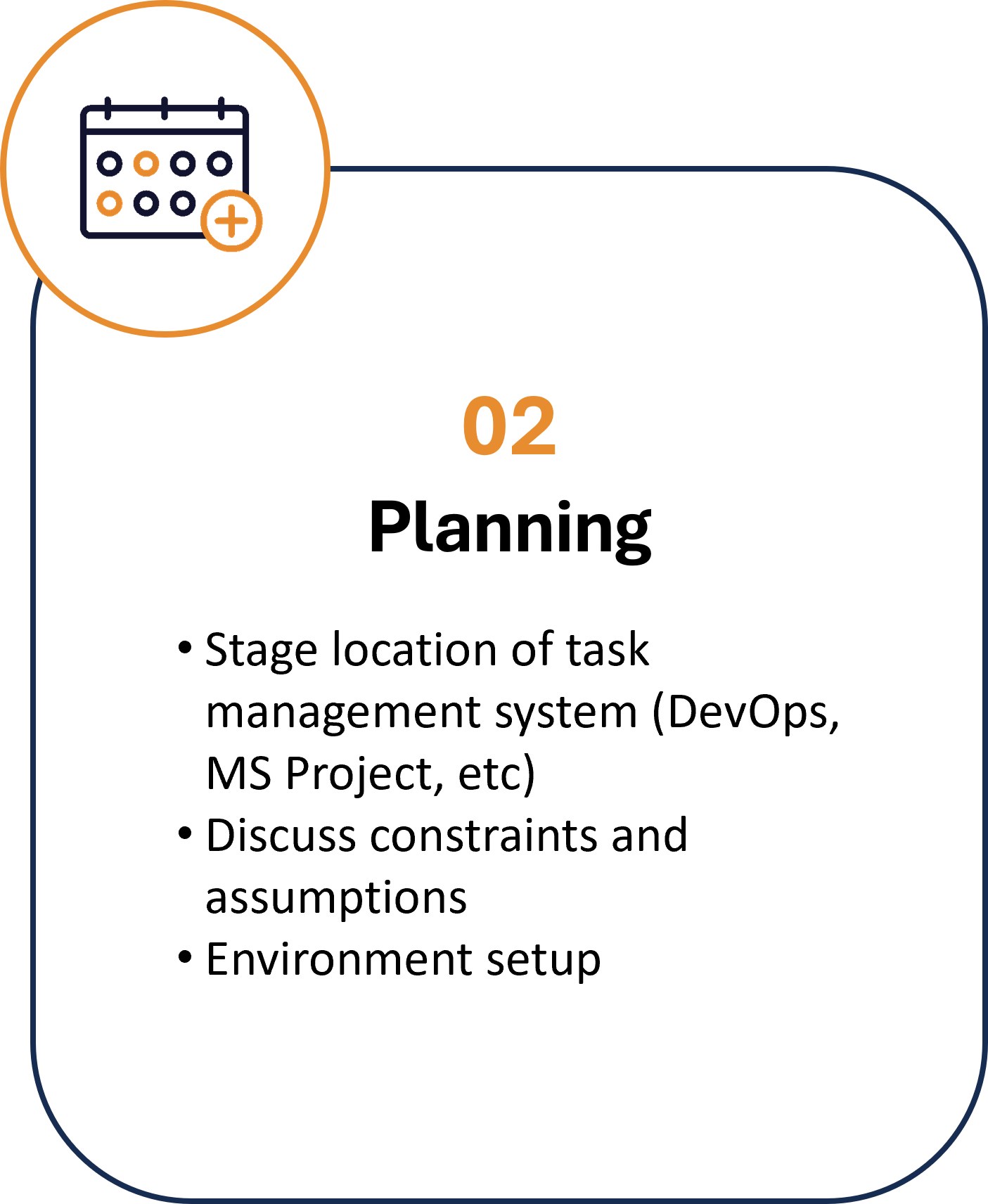
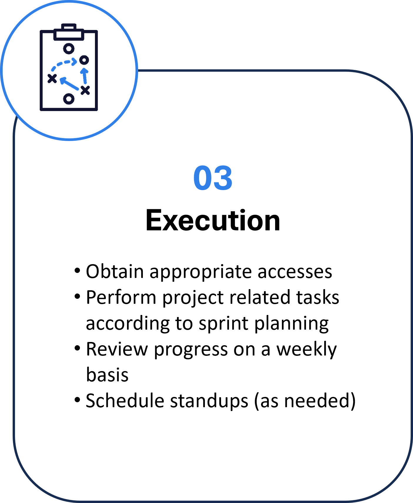
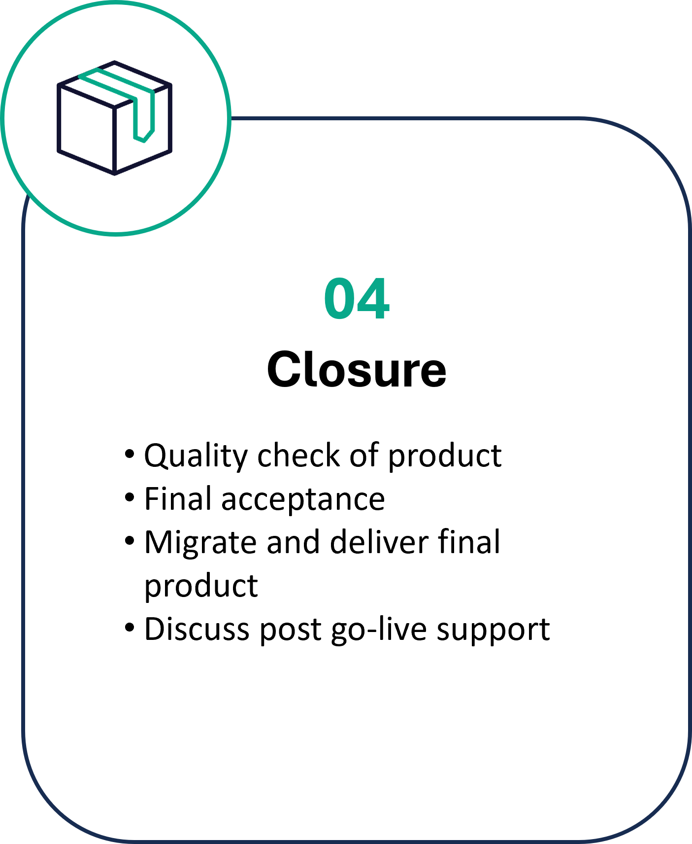
Let us build it
Partner with us to bring your objectives to life
With over 7 years of Power Platform experience, we've built dozens of production Power Apps (Canvas Apps, Model Driven Apps, Custom Pages), Power Automate Flows, and Power BI Dashboards.
**We also offer ad-hoc Power Platform help for any of your current solutions!
Our Goals For You
Modernize your business.
Leveraging the powerful capabilities of the Microsoft Power Platform, we can help you achieve these objectives. We focus on modernizing processes that rely on data-driven insights while ensuring security and scalable cloud solutions.

Centralize your data.
We offer a comprehensive suite of services that seamlessly integrate SQL databases, Dataverse, SharePoint, and more, allowing you to centralize and harness your data like never before.

Visualize your data.
Power BI is a game-changer for businesses seeking to unlock the full potential of their data. It allows organizations to gain a comprehensive view of their data, enabling them to identify trends, make data-driven decisions, and communicate key insights'.

Streamline your processes.
Elevate your business efficiency with our process optimization services. Our team specializes in redesigning forms, creating intuitive workflows, and meticulously documenting process diagrams. We understand that the key to success lies in seamless, streamlined operations.




Our Execution Strategy
ComponentDefinitions:
Component1_4:
DefinitionType: CanvasComponent
AccessAppScope: true
CustomProperties:
BorderColor:
PropertyKind: Input
DisplayName: Border Color
Description: A custom property
DataType: Color
Default: =RGBA(0, 0, 0, 0)
Button:
PropertyKind: Input
DisplayName: Button
Description: A custom property
DataType: Record
Default: |-
={Name: "SampleText", Icon: "People", Visible: false}
ComponentHeight:
PropertyKind: Input
DisplayName: Component Height
Description: A custom property
DataType: Number
Default: =130/1
ComponentWidth:
PropertyKind: Input
DisplayName: Component Width
Description: A custom property
DataType: Number
Default: =60
FieldDisplayName:
PropertyKind: Input
DisplayName: Field Display Name
Description: A custom property
DataType: Text
Default: =""//"Enter Field DisplayName"
FieldType:
PropertyKind: Input
DisplayName: Field Type
Description: 'Value should be either Text, Combobox, Date, or '
DataType: Text
Default: ="Date"
FillColor:
PropertyKind: Input
DisplayName: Fill Color
Description: A custom property
DataType: Color
Default: =RGBA(0, 0, 0, 0)
HasCheckbox:
PropertyKind: Input
DisplayName: Has Checkbox
Description: A custom property
DataType: Boolean
Default: =false
HeaderDisplayName:
PropertyKind: Input
DisplayName: Header Display Name
Description: A custom property
DataType: Text
Default: =""//"Enter Header DisplayName (optional)"
Required:
PropertyKind: Input
DisplayName: Required
Description: A custom property
DataType: Boolean
Default: =false
ShowButton:
PropertyKind: Input
DisplayName: Show Button
Description: A custom property
DataType: Boolean
Default: =true
Source:
PropertyKind: Input
DisplayName: Source
Description: A custom property
DataType: Table
Default: =
Properties:
Height: |-
=With(
{wthComponentHeader: Self.HeaderDisplayName},
If(
!IsBlank(wthComponentHeader),
160,
90
)
)
Width: =300
Children:
- Container1_48:
Control: GroupContainer@1.3.0
Variant: AutoLayout
Properties:
BorderColor: =Component1_4.BorderColor
BorderStyle: =If(Component1_4.BorderColor <> ColorValue("#ffffff"),BorderStyle.Solid, BorderStyle.None)
BorderThickness: =1
DropShadow: =DropShadow.None
Fill: =Component1_4.FillColor
Height: =Parent.Height - 1
LayoutAlignItems: =LayoutAlignItems.Stretch
LayoutDirection: =LayoutDirection.Vertical
LayoutGap: =4/1
PaddingBottom: =12
PaddingLeft: =12
PaddingRight: =12
PaddingTop: =12
RadiusBottomLeft: =2
RadiusBottomRight: =2
RadiusTopLeft: =2
RadiusTopRight: =2
Width: =Parent.Width - 1
X: =(Parent.Width - Self.Width) / 2
Y: =(Parent.Height - Self.Height) / 2
Children:
- Label1_1:
Control: Label@2.5.1
Properties:
BorderColor: =RGBA(0, 18, 107, 1)
BorderStyle: =BorderStyle.None
Font: =Font.'Open Sans'
FontWeight: =FontWeight.Semibold
Height: =If(IsBlank(Component1_4.HeaderDisplayName),0,32)
LayoutMinHeight: =70
LayoutMinWidth: =1
Size: =14
Text: =Component1_4.HeaderDisplayName
Visible: =If(And(Component1_4.Height > 64,Component1_4.Height <160),false, true)
Width: =Parent.Width - 24
Wrap: =false
- Container2_5:
Control: GroupContainer@1.3.0
Variant: AutoLayout
Properties:
BorderStyle: =BorderStyle.None
BorderThickness: =1
DropShadow: =DropShadow.None
FillPortions: =0
Height: =90/1
LayoutAlignItems: =LayoutAlignItems.Center
LayoutDirection: =LayoutDirection.Vertical
LayoutJustifyContent: =LayoutJustifyContent.SpaceBetween
LayoutMinHeight: =1
LayoutMinWidth: =1
RadiusBottomLeft: =2
RadiusBottomRight: =2
RadiusTopLeft: =2
RadiusTopRight: =2
Width: =Parent.Width
Children:
- Container13_34:
Control: GroupContainer@1.3.0
Variant: AutoLayout
Properties:
DropShadow: =DropShadow.None
Fill: =Component1_4.FillColor
FillPortions: =0
Height: =Parent.Height
LayoutAlignItems: =LayoutAlignItems.Center
LayoutDirection: =LayoutDirection.Horizontal
LayoutMinHeight: =1
LayoutMinWidth: =1
LayoutWrap: =true
RadiusBottomLeft: =2
RadiusBottomRight: =2
RadiusTopLeft: =2
RadiusTopRight: =2
Width: =Parent.Width - 2
Children:
- Container14_31:
Control: GroupContainer@1.3.0
Variant: AutoLayout
Properties:
AlignInContainer: =AlignInContainer.Center
BorderStyle: =BorderStyle.None
BorderThickness: =1
DropShadow: =DropShadow.None
Height: =Parent.Height
LayoutAlignItems: =LayoutAlignItems.Center
LayoutDirection: =LayoutDirection.Vertical
LayoutMinHeight: =1
LayoutMinWidth: =1
PaddingLeft: =1
PaddingRight: =1
RadiusBottomLeft: =2
RadiusBottomRight: =2
RadiusTopLeft: =2
RadiusTopRight: =2
Width: =Parent.Width//If(ThisItem.NumberOfFields = 1, Parent.Width-12, ThisItem.FieldWidth-12)
Children:
- Container1_49:
Control: GroupContainer@1.3.0
Variant: AutoLayout
Properties:
AlignInContainer: =AlignInContainer.SetByContainer
DropShadow: =DropShadow.None
FillPortions: =0
Height: =32
LayoutDirection: =LayoutDirection.Horizontal
LayoutMinHeight: =112
LayoutMinWidth: =1
Visible: =If(And(Component1_4.Height > 64,Component1_4.Height <130),false, true)
Width: =Parent.Width
Children:
- TextCanvas3_23:
Control: Text@0.0.51
Properties:
Align: ='TextCanvas.Align'.Center
FontColor: =RGBA(255, 0, 0, 1)
Text: =Switch(Component1_4.Required,true,"*"," ")
VerticalAlign: =VerticalAlign.Middle
Width: =12
- TextCanvas1_31:
Control: Text@0.0.51
Properties:
Align: ='TextCanvas.Align'.Start
AlignInContainer: =AlignInContainer.Start
BorderStyle: =BorderStyle.None
BorderThickness: =1
ContentLanguage: |-
=With(
{
wthFieldName: "Open to Media",
wthFieldType: LookUp(
Table(
{Value: "Text"},
{Value: "Dropdown"},
{Value: "Date"},
{Value: "Checkbox"}
),
Value = "Checkbox"
).Value,
wthFieldWidth: Self.Width,
wthFieldHeight: 77,
wthNumberofFields: 1,
wthFlexibleWidth: 1,
wthRequired: false
},
JSON(
{
FieldName: wthFieldName,
FieldType: wthFieldType,
FieldWidth: wthFieldWidth,
FieldHeight: wthFieldHeight,
NumberofFields: wthNumberofFields,
FlexibleWidth: wthFlexibleWidth,
Required: wthRequired
}
)
)
FillPortions: =1
LayoutMinWidth: =1
Text: =If(!IsBlank(Component1_4.FieldDisplayName), Component1_4.FieldDisplayName, "")
VerticalAlign: =VerticalAlign.Middle
Visible: =!IsBlank(Component1_4.FieldDisplayName)
Width: =Parent.Width
Wrap: =false
- Container1_61:
Control: GroupContainer@1.3.0
Variant: AutoLayout
Properties:
AlignInContainer: =AlignInContainer.SetByContainer
DropShadow: =DropShadow.None
FillPortions: =0
Height: =32
LayoutAlignItems: =LayoutAlignItems.End
LayoutDirection: =LayoutDirection.Horizontal
LayoutGap: =8
LayoutMinHeight: =0
LayoutMinWidth: =1
Width: =Parent.Width- 2
Children:
- CheckboxCanvas1_12:
Control: CheckBox@0.0.30
Properties:
ContentLanguage: =Lower(Component1_4.FieldDisplayName)
Label: =If(!IsBlank(Component1_4.FieldDisplayName),"",Component1_4.FieldDisplayName)
Visible: =If(Component1_4.FieldType = "Checkbox", true, Component1_4.HasCheckbox)
Width: =If(!IsBlank(Component1_4.FieldDisplayName),Self.Height,If(Component1_4.FieldType <> "Checkbox",Self.Height,Parent.Width))
- ComboboxCanvas2_27:
Control: ComboBox@0.0.51
Properties:
Appearance: ='ComboboxCanvas.Appearance'.FilledLighter
BorderColor: =RGBA(173, 173, 173, 1)
BorderStyle: =BorderStyle.Solid
BorderThickness: =1
ContentLanguage: =TextCanvas1_31.ContentLanguage
DisplayMode: =If(Component1_4.HasCheckbox,If(CheckboxCanvas1_12.Checked, DisplayMode.Edit, DisplayMode.Disabled), DisplayMode.Edit)
FillPortions: =1
InputTextPlaceholder: ="---"
Items: =Component1_4.Source
LayoutMinWidth: =0
Visible: =Component1_4.FieldType = "Combobox"
Width: =Parent.Width - 12
Children:
- Value1_2:
Control: ComboBoxDataField@1.5.0
Variant: textualColumn
IsLocked: true
Properties:
FieldDisplayName: ="Value"
FieldName: ="Value"
FieldType: ="s"
Order: =1
- DatePickerCanvas1_27:
Control: DatePicker@0.0.46
Properties:
Appearance: ='DatePickerCanvas.Appearance'.FilledLighter
BorderColor: =RGBA(173, 173, 173, 1)
BorderStyle: =BorderStyle.Solid
BorderThickness: =1
DisplayMode: =If(Component1_4.HasCheckbox,If(CheckboxCanvas1_12.Checked, DisplayMode.Edit, DisplayMode.Disabled), DisplayMode.Edit)
FillPortions: =1
Format: ='DatePickerCanvas.Format'.Short
LayoutMinWidth: =1
Placeholder: ="---"
Visible: =Component1_4.FieldType = "Date"
Width: =Parent.Width
- TextInputCanvas1_33:
Control: TextInput@0.0.54
Properties:
Appearance: ='TextInputCanvas.Appearance'.FilledLighter
BorderColor: =RGBA(173, 173, 173, 1)
BorderStyle: =BorderStyle.Solid
BorderThickness: =1
DisplayMode: =If(Component1_4.FieldType = "Text",If(CheckboxCanvas1_12.Checked,DisplayMode.Edit,DisplayMode.Disabled),DisplayMode.Edit)
FillPortions: =1
LayoutMinWidth: =1
Placeholder: ="---"
TriggerOutput: ='TextInputCanvas.TriggerOutput'.Keypress
Visible: =Component1_4.FieldType = "Text"
- ButtonCanvas6_8:
Control: Button@0.0.45
Properties:
Icon: =Component1_4.Button.Icon
Layout: ='ButtonCanvas.Layout'.IconOnly
OnSelect: =
Visible: =Component1_4.ShowButton
Width: =32
- Container12:
Control: GroupContainer@1.3.0
Variant: ManualLayout
Properties:
BorderStyle: =BorderStyle.None
BorderThickness: =1
DropShadow: =DropShadow.None
Height: =Parent.Height
PaddingLeft: =2
PaddingRight: =2
RadiusBottomLeft: =2
RadiusBottomRight: =2
RadiusTopLeft: =2
RadiusTopRight: =2
Width: =Parent.Width
X: =0/1
Y: =0/1